Intro.
Over my winter break, I went back to Japan to visit my family and friends. While my stay back home, I was asked by a family friend to redesign his bar’s menu. Our family friend, Anthony, began his business a few years ago, but he never had anyone design a menu for him. He’s a pretty old-school type of guy so instead of creating something digitally, he made his menu completely analog by literally cutting out bits and pieces out of a flyer and gluing them on a page. This is what it looked like:
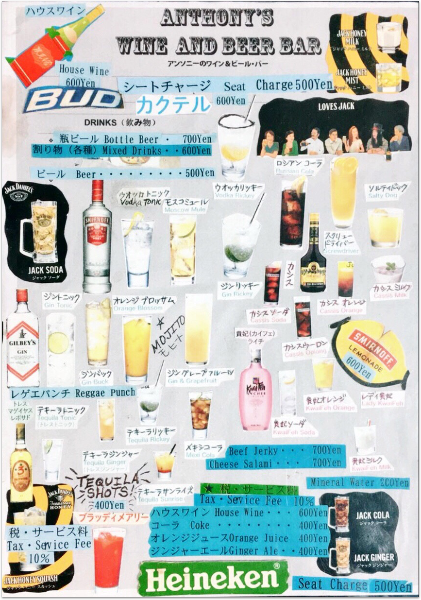
I was impressed. I don’t think that I would have had the patience to put all the pieces of the menu onto one page. Props to Anthony!
The Big Question.
How can I make the menu experience for Anthony’s Bar more approachable, delightful, and consistent with the look and feel of the bar?
Challenges.
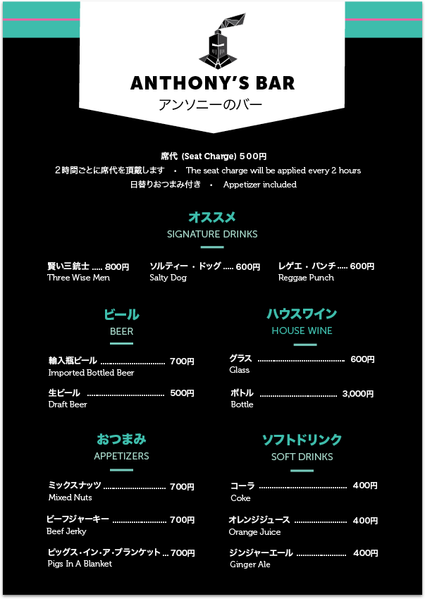
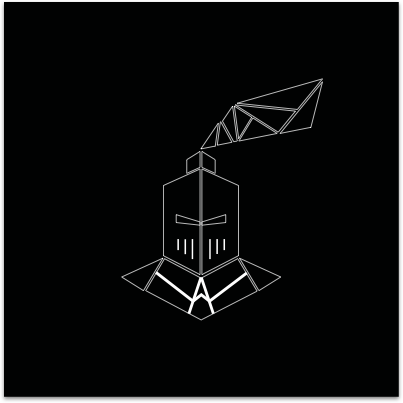
Renaming the bar and coming up with a new logo. Anthony wanted to change his bar’s name from “TBH Knight Club” to “Anthony’s Bar.” Although he changed the name of his bar, he still wanted to maintain the knight theme so I simplified the original knight logo that he had.
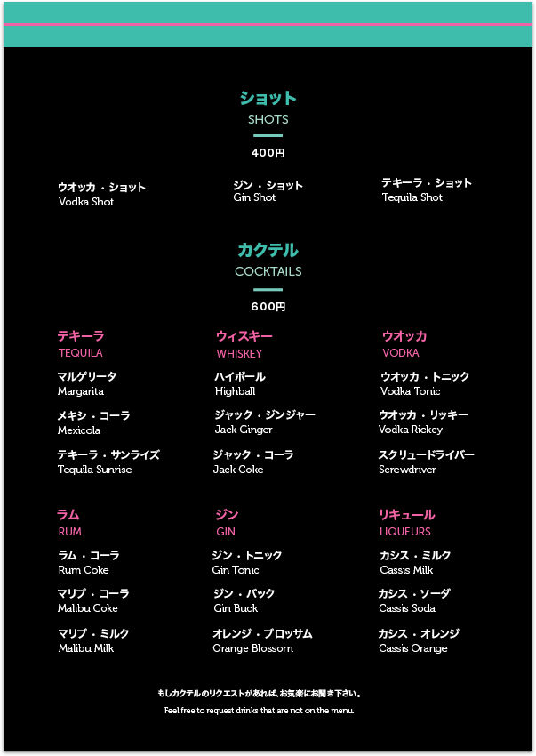
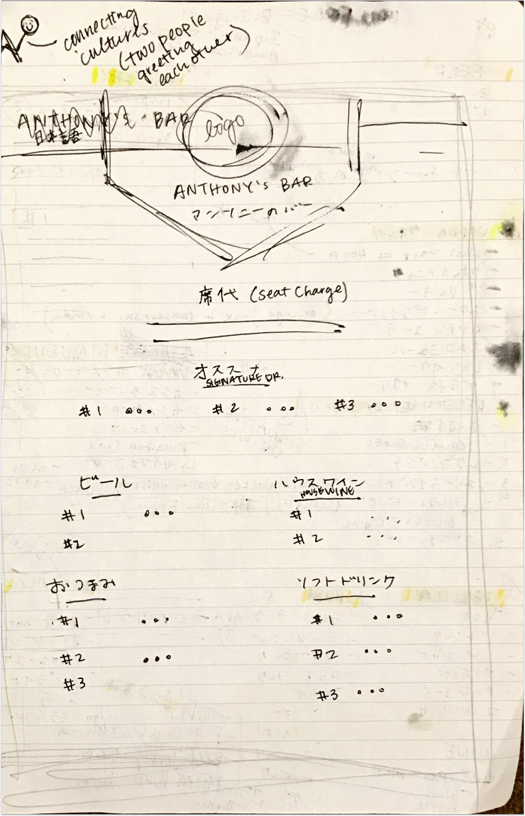
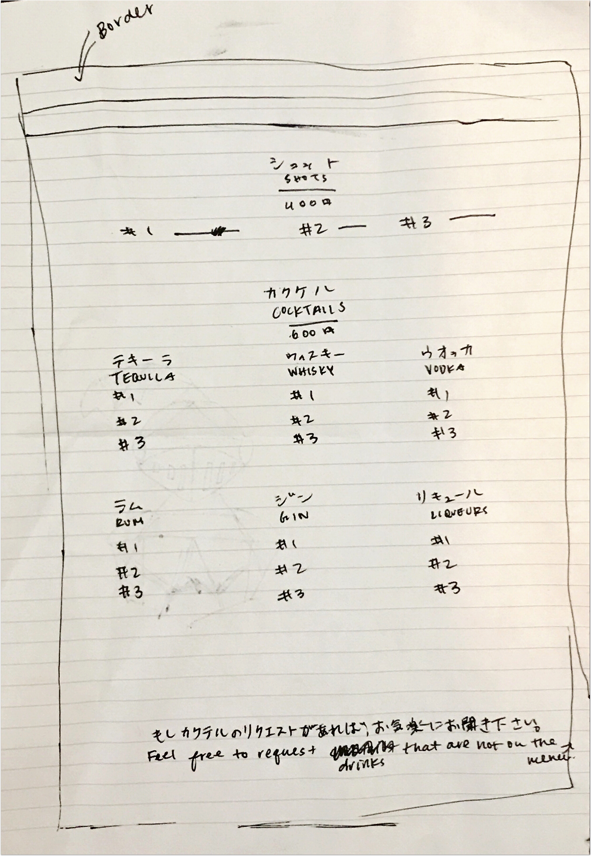
Laying out the menu items on the page. As shown on the original menu, you can see that there are a lot of menu items on the page…everywhere. At first glance, it can be a bit overwhelming to see this so I wanted to have a better structure for the menu. So I sketched out the following layout:
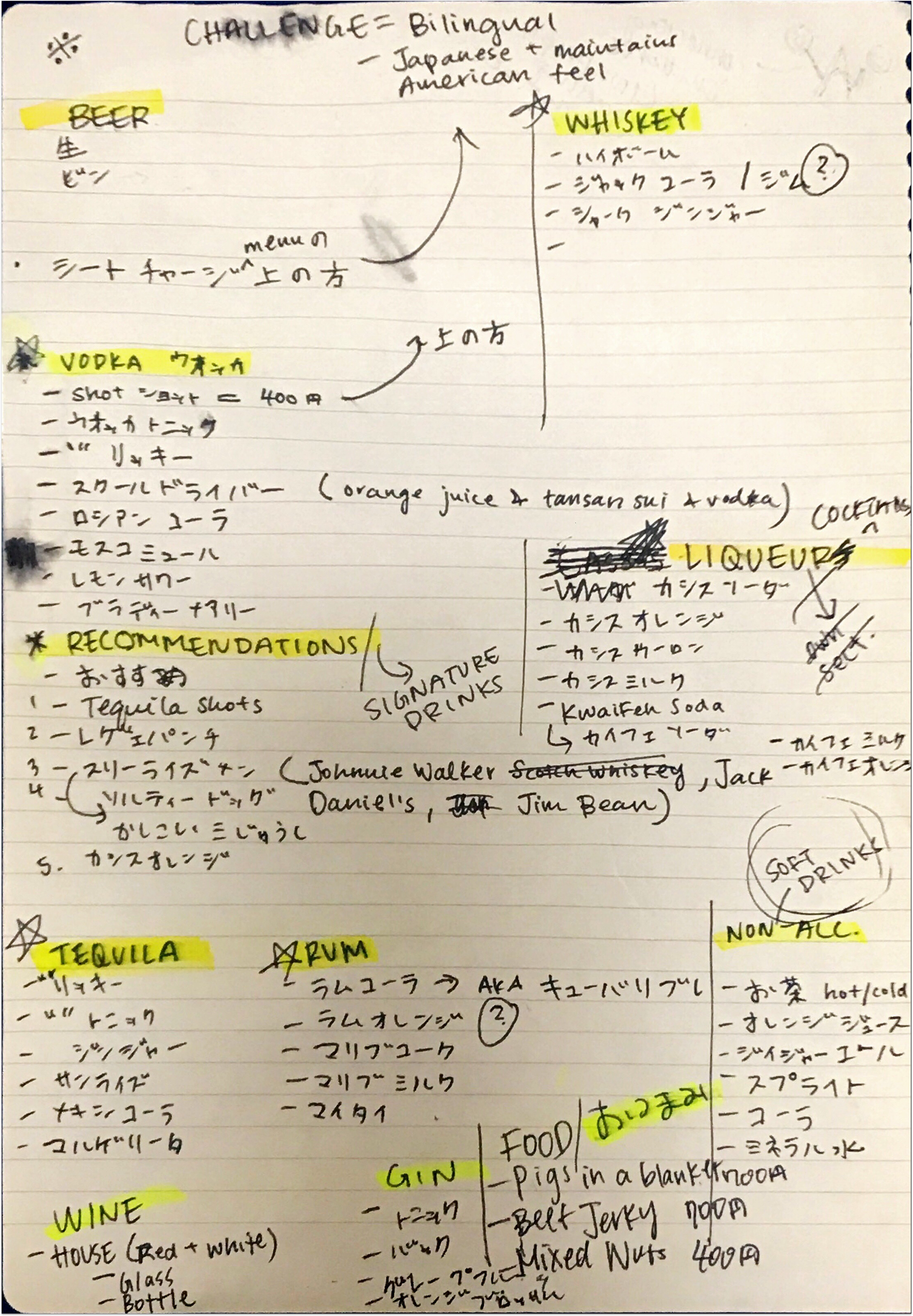
Making the menu bilingual. Since Anthony mainly gets Japanese and English-speaking customers, I wanted the menu to be friendly for anyone who dropped by.

English & Japanese friendly text
Approach.
research.
After speaking to some of Anthony’s regular customers, I learned that they all agreed that having clearer sections to indicate different types of drinks would be helpful. Some even mentioned and suggested that they would like to have known about the most recommended/signature drinks when they first came to the bar.
ideate.
Layout. My notes aren’t necessarily the most organized… but they helped me get a better feel for how many menu items that I was going to be working with. I wrote down items that were already on the original menu and added in some more things that Anthony wanted to include in this newer version. Shown below, are the notes and layout sketches of the menu.
Logo. For this logo, I was inspired by origami. I wanted to tie in a little piece of Japanese culture to this logo by making a geometric knight to resemble origami pieces.
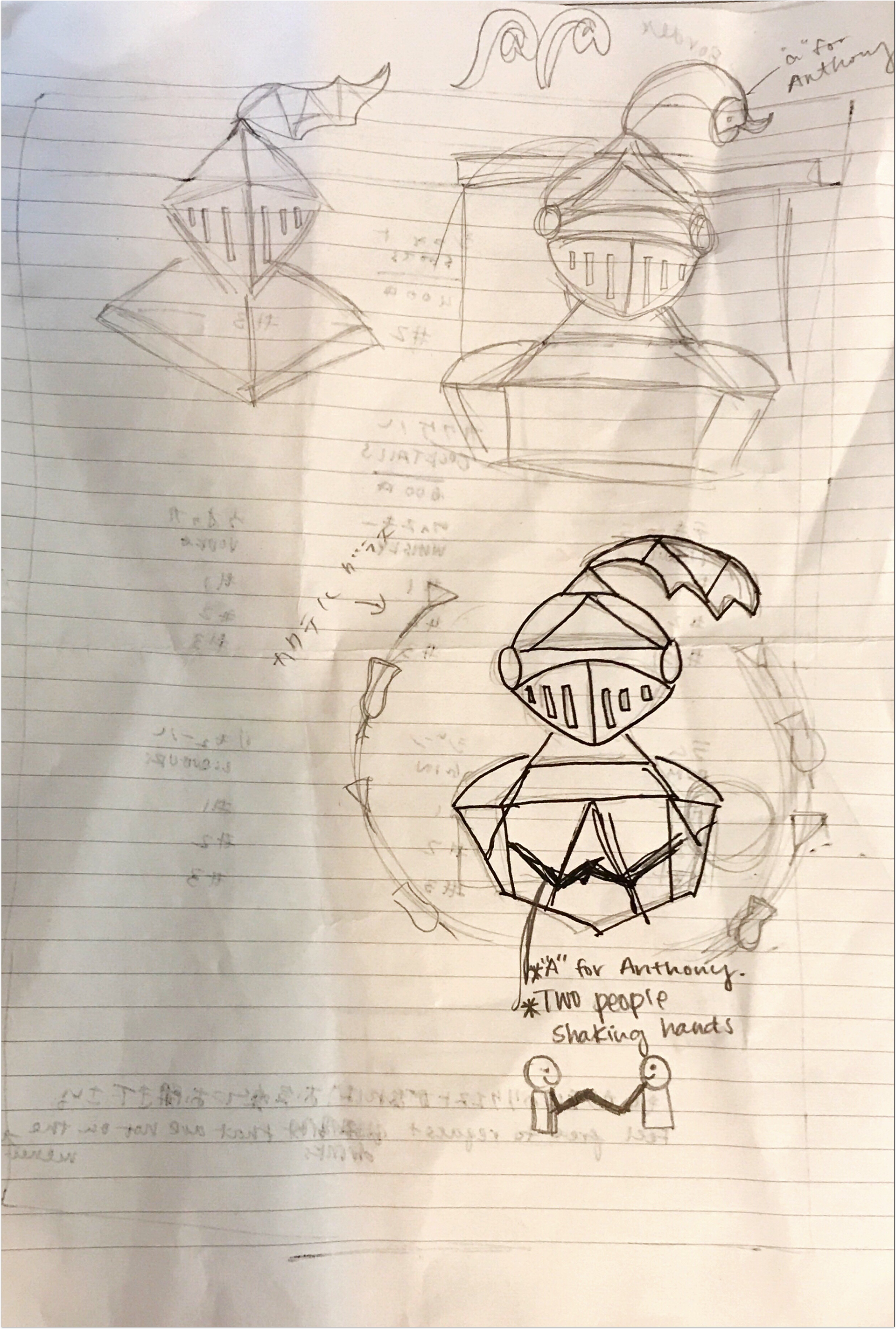
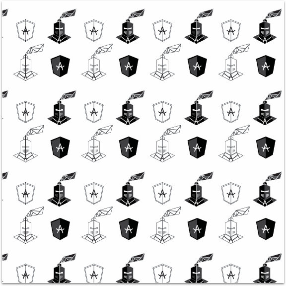
Just for fun, I decided to create a knight themed pattern that would eventually be used for marketing purposes. Once I created a logo that both Anthony and I were satisfied with, I had a better feel for the menu.

Project.