Intro.
I started volunteering as an advertiser for a club at Utah Valley University (UVU) called “I Am First”, a club for first-generation students whose neither parent or guardian has completed a further education beyond high school, in the fall of 2017. As the advertiser, I have helped create some posters for their club events. A few months after I began helping out with this club, I was asked to work on an inaugural journal issue to represent first-generation students' intersecting identities. The club had been wanting to publish a journal for a while so I immediately took them up on their offer and began brainstorming ideas.
The Big Question.
How will I present the stories and contributions from first-generation students, graduates, staff, and faculty in a way that goes along with "I Am First" club's identity?
Challenge.
Designing with intentionality. The purpose of this journal is to not only recognize the college experiences of first-generation students at UVU, but to also showcase the work that they, as well as graduates and staff, have done. I had to come up with a meaningful way to present these stories.
Approach.
research.
To get a better understanding of what the club was looking for in this journal, I met up with the First-Generation Students Program Manager, Garrett. Right from the start, I was informed by Garrett that they wanted something that was consistent with their type of design style — simplicity. They wanted a design that was not only simple but recognizable as “I Am First”, if someone were to see it. We wanted this project to help publicize the club so that more people around campus would gain a better understanding of the club mission and to potentially attract first-generation students (who aren’t currently in the club) to gain extra assistance on their journey to achieve academic success.
ideate.
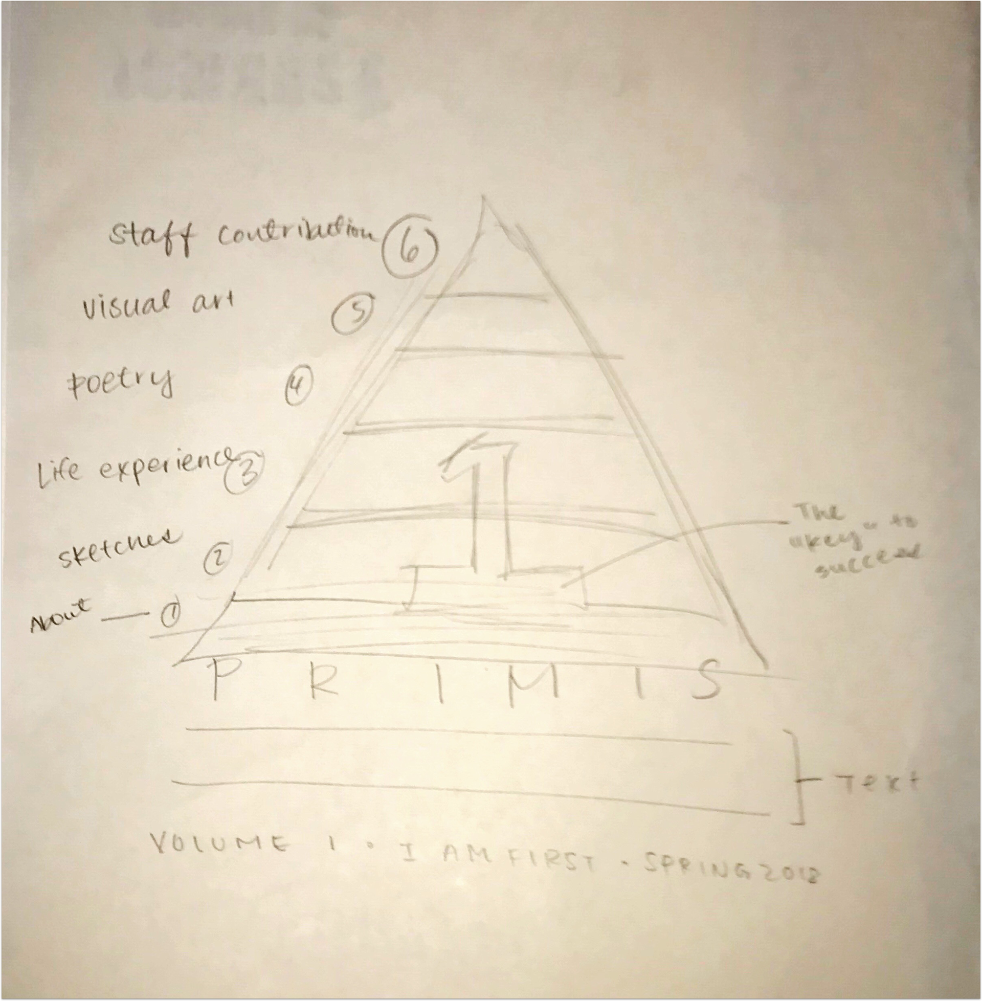
Like the many of the projects that I have done in the past, the ideation stage was rough. I wanted a meaningful design but I was lacking inspiration; I had a difficult time conceptualizing an idea that was solid, something I actually wanted to move forward with for the entire journal. BUT, after giving myself a week or two to come up with more ideas, I came up with the following rough sketch:
make.
Designing every little aspect with intentionality is a difficult task. When designing with intentionality, you have to consider why you want to include something in the first place. For this project, I literally spent days coming up with this cover. Even though it’s such a simple layout, it still took me quite some time. As Steve Jobs once said:
“Simple can be harder than complex: You have to work hard to get your thinking clean to make it simple. But it’s worth it in the end because once you get there, you can move mountains.”
Sometimes, the simplest ideas take a lot longer to come up with than more complex ideas because you have to put more thought into it. At the beginning, I came up with complex, meaningless designs… but once I hit a point of realization that I needed to unbundle the complexities, I started over from scratch to “think clean.”
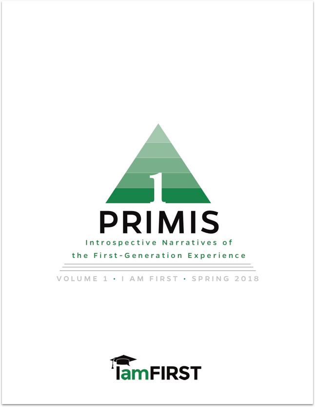
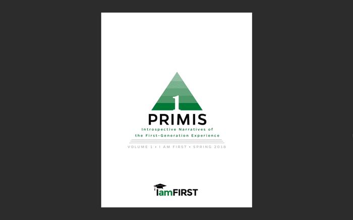
I was first inspired by Maslow’s Hierarchy of Needs Pyramid and thought that it’d be cool to somehow incorporate that into the cover. Like Maslow’s motivational theory in psychology where one level needs to be fulfilled before moving up to the next level and so on, I thought to myself that life in general is like a pyramid with different levels or milestones. Before we can move onto a new chapter in our lives and grow, we have to satisfy the lower milestones. In this case, since I was designing a product for first-generation students, I wanted the goal to be graduating from college. Graduating college is a huge milestone in anyone’s life; it takes a lot of dedication and hard work to achieve this but once it’s done, it can unlock a plethora of possibilities. With the use of negative space, I put the number “1” in the middle to not only symbolize first-generation students but to also make it appear as a keyhole to success.
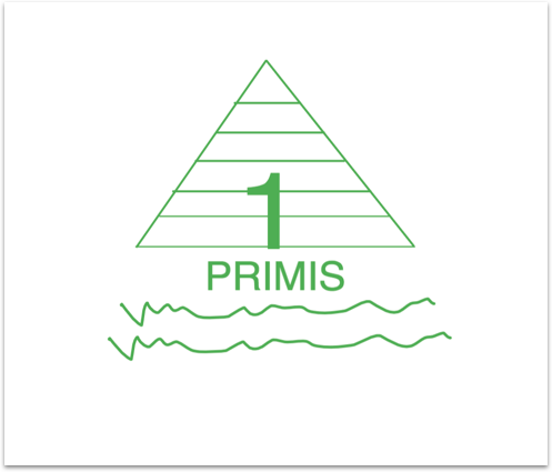
I also wanted to implement the geometric design of the cover into the different sections of the journal so I did the following:
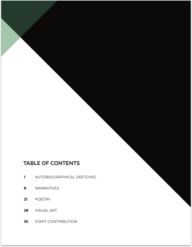
In the table of contents, I kept the layout consistent with the cover by using triangular shapes and the same color scheme of black, gray, white, and green.
I divided up the journal into five different categories: autobiographical sketches, narratives, poetry, visual art, and staff contribution submissions. For this reason, the cover art also has five levels. I created the following artwork for each of the sections:
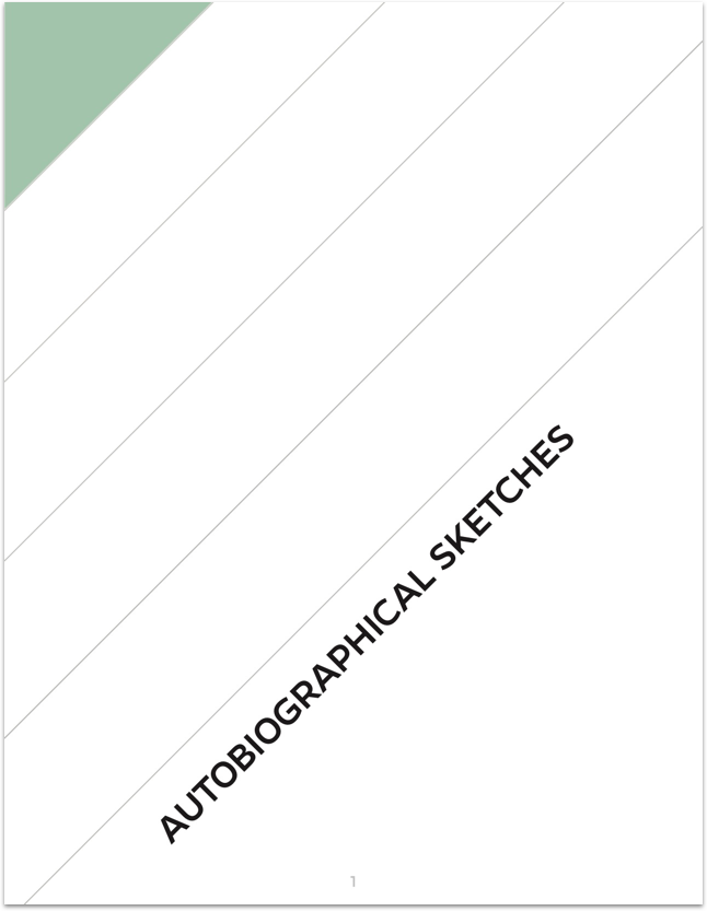
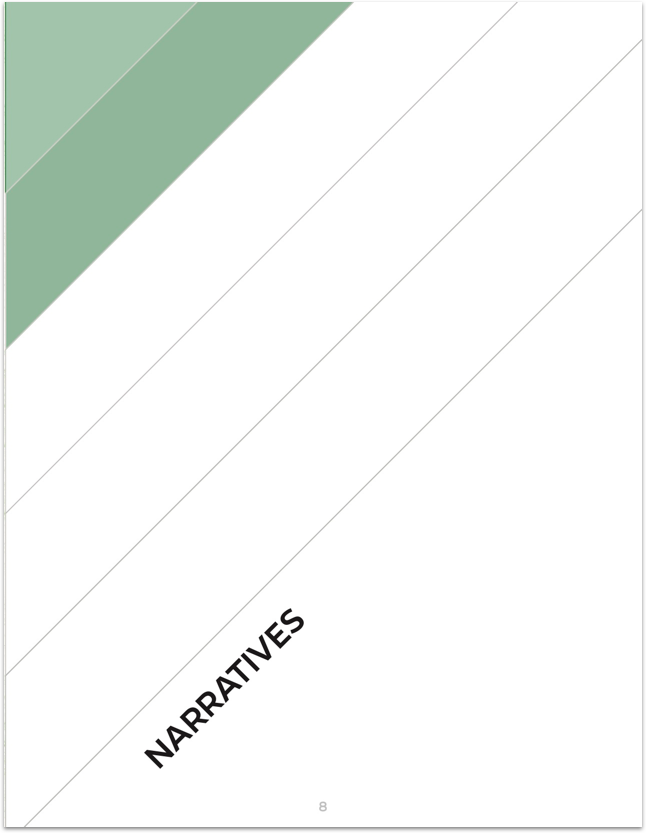
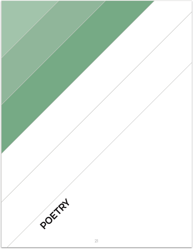
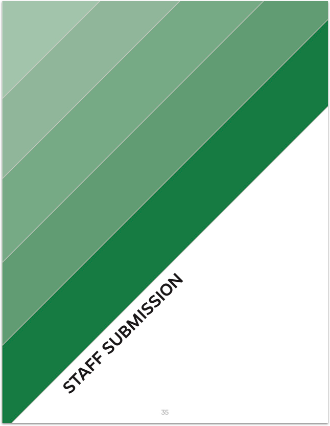
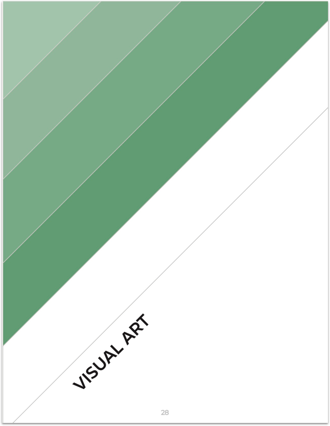
As the reader progresses through the journal, each level of the pyramid fills up to subtly show them where they are in the publication.
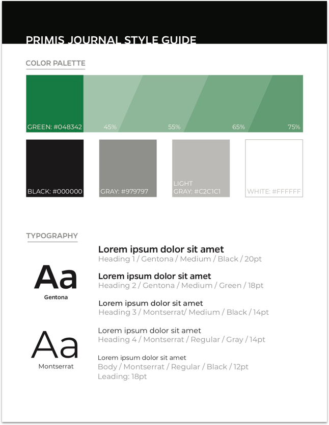
PRIMIS Journal Style Guide
Project.