
Intro.
The process of choosing a program for any major can be extremely stressful and time-consuming. Although schools like Utah Valley University (UVU), Brigham Young University (BYU), and the University of Utah (U of U) all offer information on their film programs on their website, having to look back and forth between each site can be a tedious task. We were asked to create a website where prospective students and parents would be able to easily compare the film programs at these schools.
The Big Question.
How can we make it easier for people interested in film to find programs in Utah so that they could easily compare them?
Challenges.
Running into a roadblock. More than halfway into this project, we ran into a problem and had to make a pivot from the original plan to meet the client’s new needs.
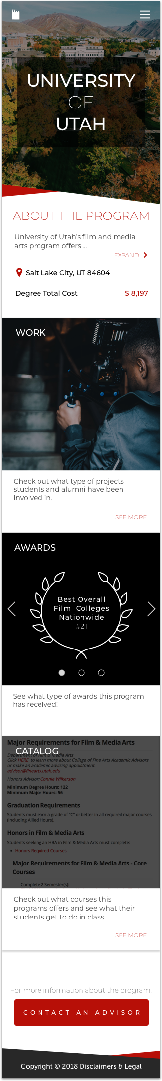
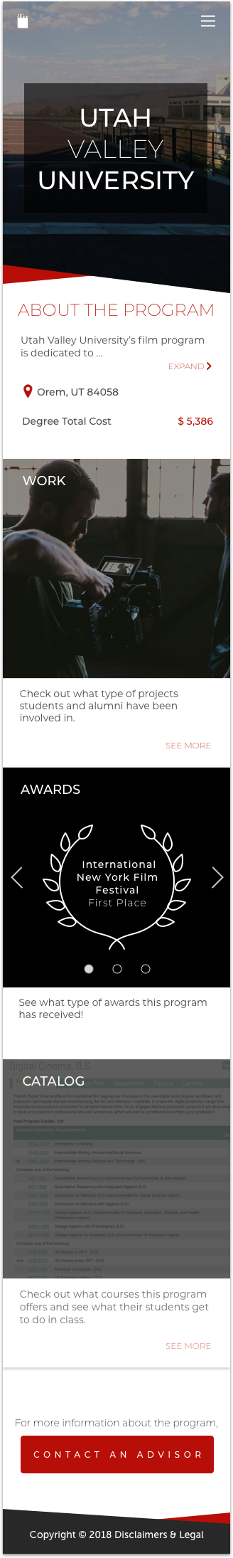
Not showing any bias towards one particular school. When creating this website, we had to make sure that all of the schools with film programs were represented equally.
Figuring out who would be visiting this website. We had a general idea of who would be visiting the website but to make sure that we were correct, we did some research to back it up.
Approach.
research.
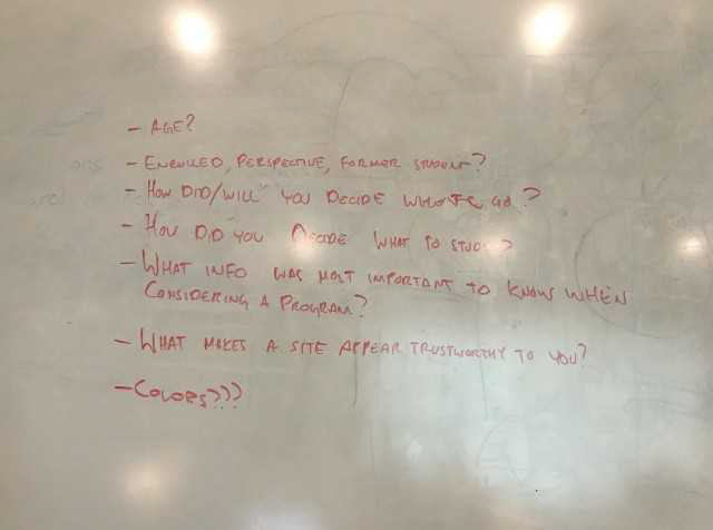
To understand what our users were really interested in, we created survey questions that we could use to gather data on our audiences’ attributes and the features and content of our site. To create a web version of our survey, we used Typeform. We then posted the link to our online survey on each of our individual social media accounts; as a result, we were able to get close to 100 responses. The results of our survey are shown below.
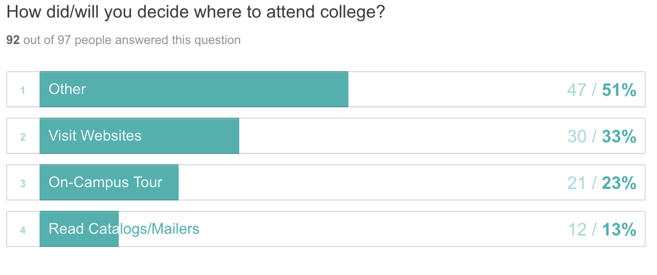
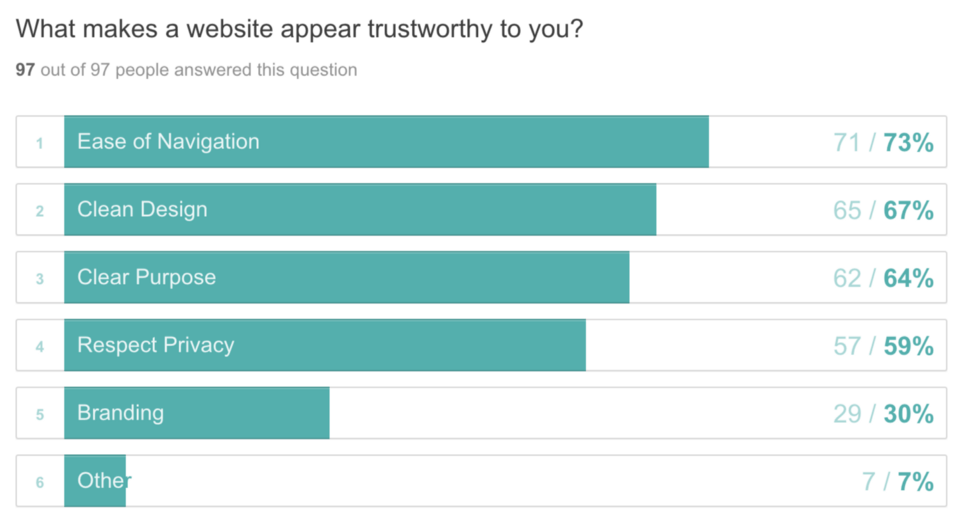
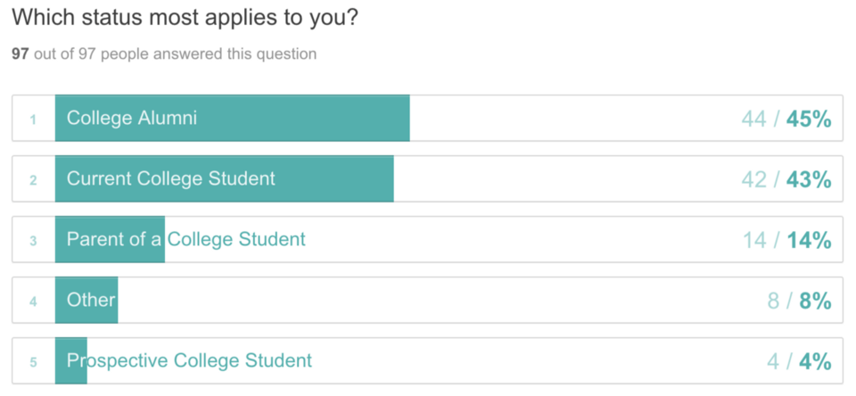
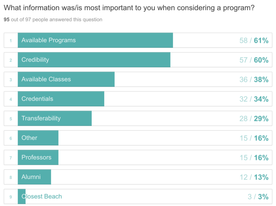
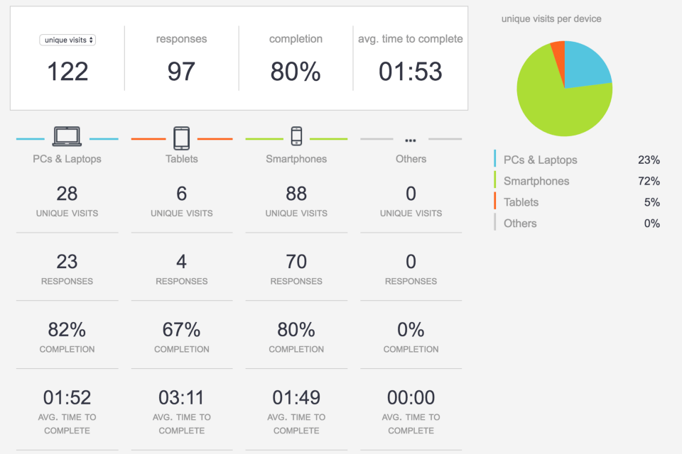
Out of the 122 visits that we had on our survey, we received a total of 97 responses. As shown in the pie graph above, it is apparent that a majority of the people who participated accessed the survey through their smartphones. The second most popular way people accessed the survey were through their PCs and laptops. We also found that 44 out of the 97 people who took the survey answered that they were college alumni. On top of this, the most important information when considering a program was the available programs a school had, not necessarily the alumni or professors. Other things we found were that what makes a website trustworthy to a user, is the ease of navigation and that the second most popular way that people decided/will decide on a college is through the school’s website.
pivot plan & strategy.
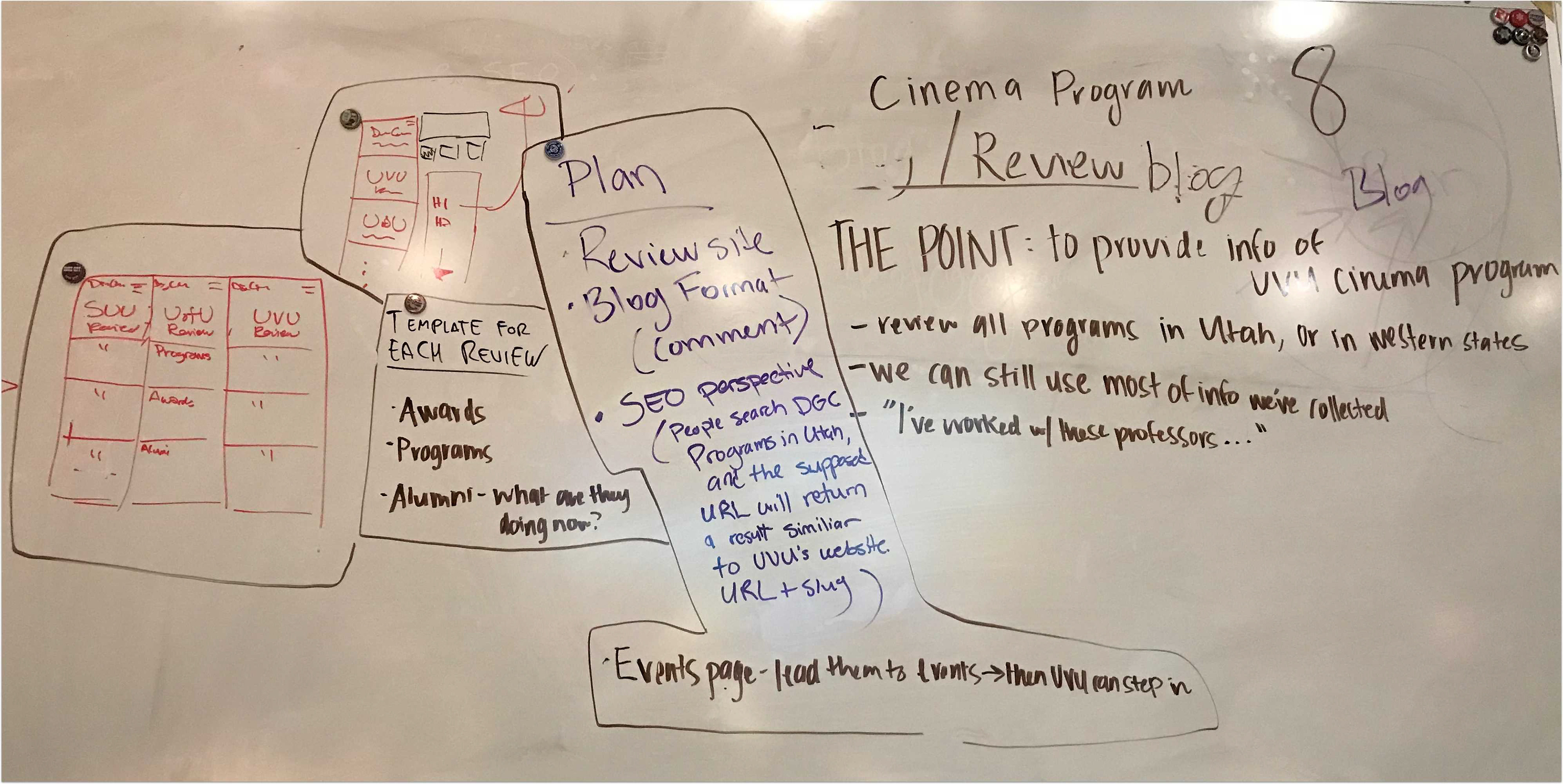
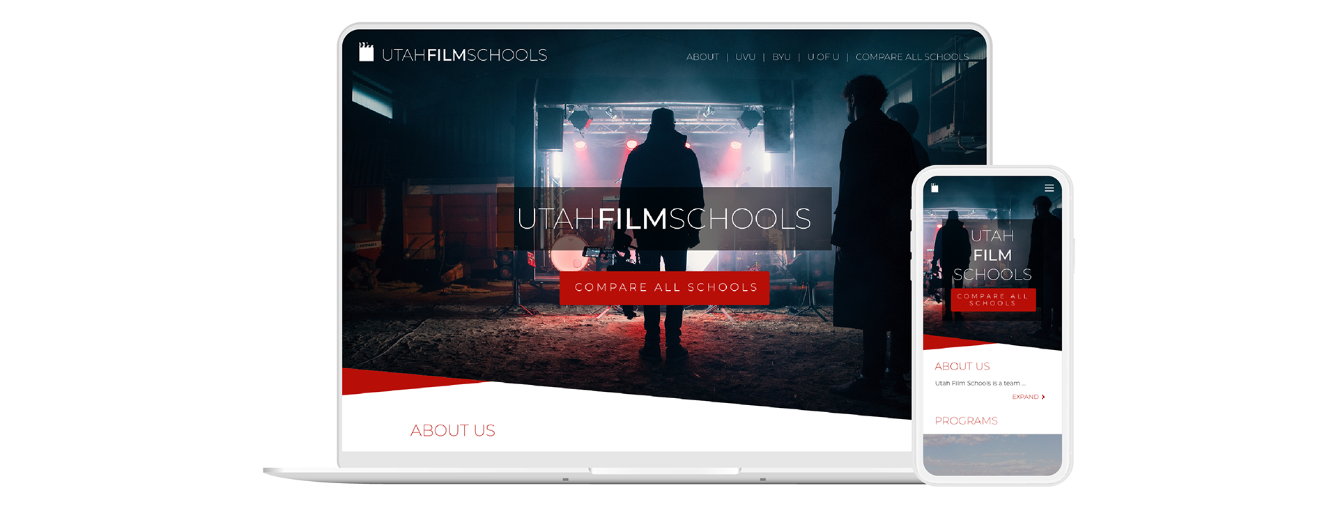
This was one of the hardest stages that we had to go through as a team because we weren’t quite sure what our client’s new expectations were. However, after a class period of brainstorming, we came up with elements that we wanted to include in our new website. As shown below, we decided to include sections like “Awards”, “Programs”, and “Alumni.” Later on, however, a new team and I had to iterate the sections again; we included sections on “Work”, “Awards”, “Catalog”, and “Advisors”.
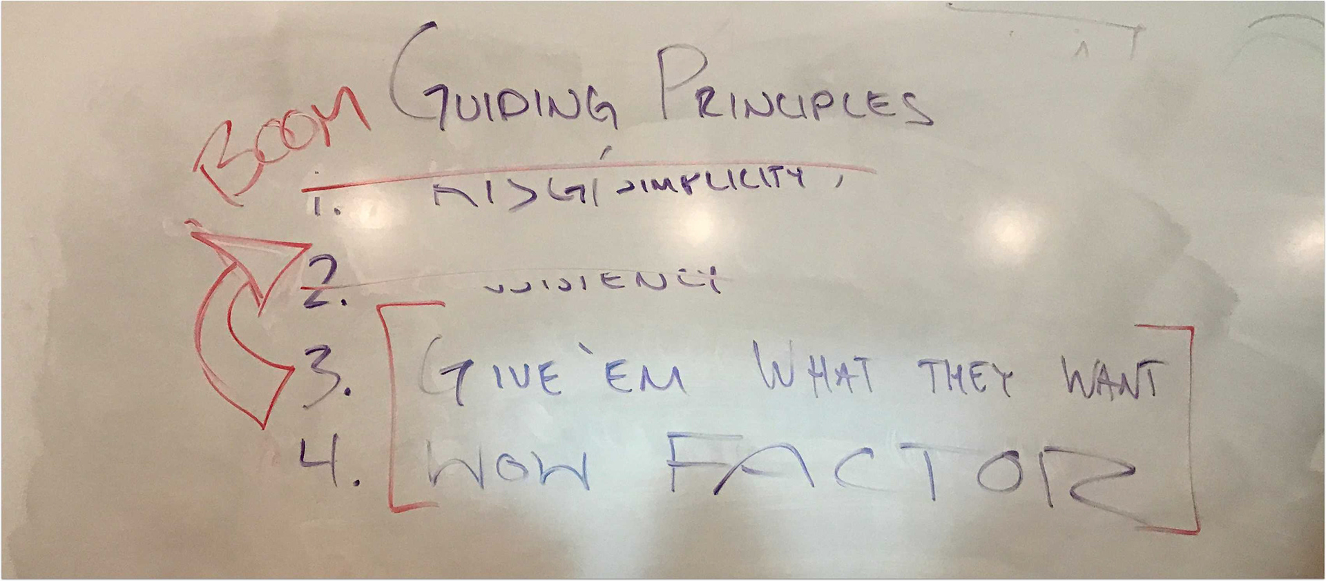
design principles.
We were inspired by three main design principles: Simplicity, Giving the People What They Want, and the WOW Factor.
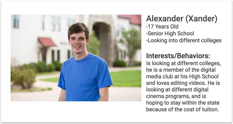
persona.
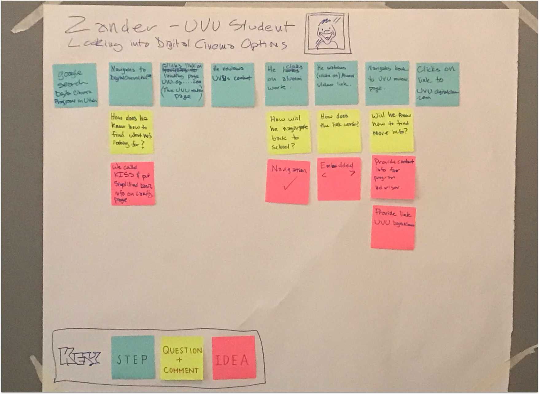
scenario map.
Creating a scenario map of our primary persona, Alexander, helped us understand what type of steps he would take to complete a specific task. Outlining a scenario map is simple: post-it-notes. With different colored post-it-notes, we outlined Alexander’s steps, questions, comments, and ideas.
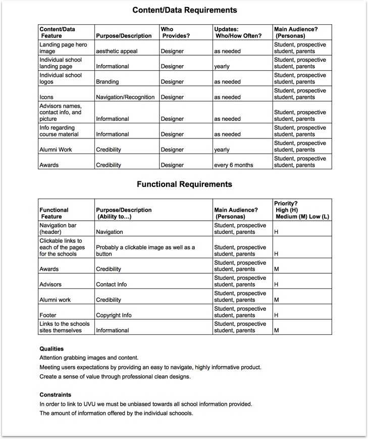
scope draft.
We then created a draft of the final requirements/features for our website:
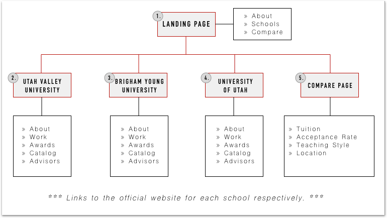
site map.
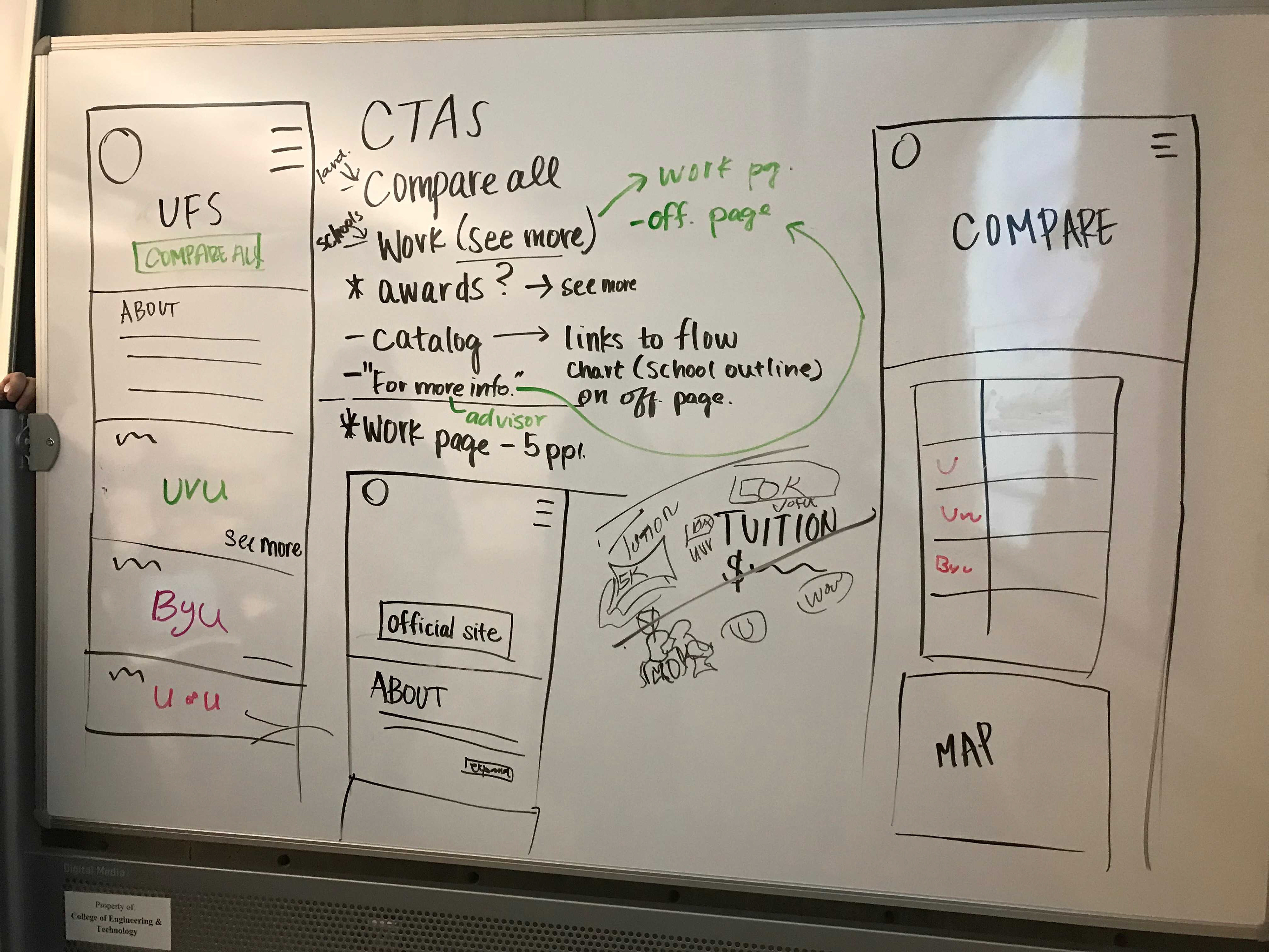
wireframes.
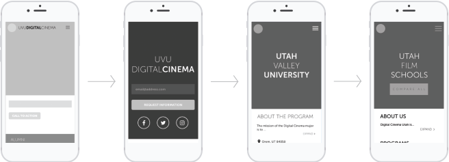
Creating wireframes helped us visualize the framework and overall layout of the site. Shown below are the wireframes that have been adapted over time to fit the needs of the site. By the fourth iteration, we decided to include a call-to-action button, “Compare All Schools” to help our audience to easily access general information about the film programs at UVU, BYU, and U of U.
style guide.
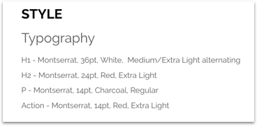
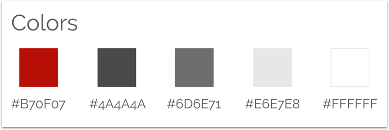
The style guide is what helps define and keep a design consistent and cohesive. In this style guide, the color palette and the typography are defined. Why is it important? A style guide is important since it acts as a guide to how a project is supposed to look and ensures that everyone on the team is on the same page.
surface comps.
Like the wireframes, we had to keep iterating the design. It’s a looping cycle, but this is what the end results came out to be.

prototype.
Prototyping is critical in any type of project. To give the developers on my team a better idea of what the website was going to look and function like, I prototyped it in Invision.
Project.
From start to finish, a lot has changed. Overall, the end product of my team’s project turned out very well. Even though the project did not turn out how we had expected it to be in the beginning, during the second round of the ideation stage, we were still able to come together and work efficiently to meet deadlines and produce something that was not only visually pleasing, but functional.